The layout for August is a bit late, because I made it for an entry in ![[livejournal.com profile]](https://www.dreamwidth.org/img/external/lj-community.gif) xf_is_love and my posting day there is only today. So here's my first X-Files layout - better late than never, I know! For what feels like ages I had wanted to make this layout and now I've finally done it, thanks to this community.
xf_is_love and my posting day there is only today. So here's my first X-Files layout - better late than never, I know! For what feels like ages I had wanted to make this layout and now I've finally done it, thanks to this community.
| Filed Under X | |
| preview | 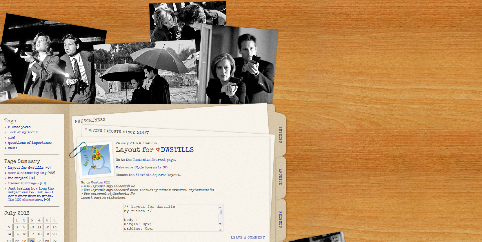 Click here for live preview, then click on the layout's icon. |
| layout info | Based on Flexible Squares. Works for all account types. Tested in Firefox 22, Google Chrome 28 and Internet Explorer 10. You shouldn't make the content/sidebar/maincontent any wider, but if you want, you could make it narrower. That would require some adjusting of other elements, though. Not having the possibility to determine a point around which to rotate is really annoying! It rotates around the middle of the element. So if you have more than 4 tabs in the navheader, you’ll have to change top. But I’ve set it to a certain width, so as long as you have 6 tabs or less, you don’t have to change left. |
| how to implement this layout | Go to the Customize Journal page. Make sure Style System is S2. Choose the Flexible Squares layout. Go to Custom CSS » Use layout's stylesheet(s): No » Use layout's stylesheet(s) when including custom external stylesheet: No » Use external stylesheets: No insert custom stylesheet |
8 comments | Leave a comment